BOOK COVER PROJECT
The goal of this project was to create three different book covers for one classic book. One had to focus on typography, one had to use elements we had made with our hands, and the last one had to be one of our choice. All three covers had to draw a potential reader in and reference themes inside the book without giving too much away. These are the three covers I created for Mary Shelley's classic book Frankenstein.
Typographic Cover
For the typographic cover I realized that I could great a perfect rectangular grid with the title of Frankenstein. I wanted the typographic cover to be a homage to the pop culture version of Frankensteins monster and create some familiarity with potential readers. I also used typography to illustrate the ominous theme of man vs creation and loneliness that permeate throughout the narrative. This is seen in the font choice and the full justification that give it a heavy feeling. I wanted the book to look like a slab of metal that might weigh hundreds of pounds to represent the pressure Dr. Frankenstein feels throughout the book. The black pages were added as a reference to the gothic feel of the book.


Choice Cover
For my choice cover I wanted to create a simple illustration that you might see on the cover of a penguin classics book, but it quickly took on a life of it's own once I scanned in the drawing and started playing with it in illustrator. I really liked the brushed edges that my marker gave it, and I felt like it gave the cover a rough feel that fit with the overall feel of the book. The Black and gold color scheme came when I was playing around with the colors in photoshop. I think the colors work because Frankenstein is a classic and gold is often associated with things that have become classics in their respective genres.


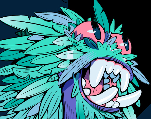
Hand Made Cover
For the hand made cover I wanted to come back to those original themes of loneliness, man versus his creation and rejection that Frankenstein and his monster confront throughout the book. I printed out several faces from Unsplash on a laser jet printer and cut out different pieces of the faces with a razor. I then arranged them and put them face down on a paper and rubbed an acetone marker on them, giving the worn look to it. This is a reference to how Frankenstein created his monster but more importantly the worn image makes the face look almost tormented. I decided to go with the black on black color scheme to heighten this. I also refrained from putting the title and author on the cover and instead resorted to putting it on the spine to give the image some more power.